At a glance
Overview
Delta's shower door website (deltashowerdoors.com) was growing in traffic but quietly failing its users. Visitors were searching for "installation" and "installation and care" at high rates, not because they wanted to buy, but because the site wasn't answering a basic question before they asked it. As a UX researcher and designer embedded in the project, I used behavioral analytics to identify the gap, developed a content strategy to close it, and redesigned the site's core product finder tool based on what users were actually doing, not what we assumed they were doing.
The Problem
1. Users were searching for help the site wasn't providing.
When I began tracking Algolia search data in April 2024, "installation" and "installation and care" were among the top queries on the site, accounting for dozens of searches per week despite a growing traffic base. This was a signal, not a coincidence. Users arriving at a hardware product site had real questions about installation that the content wasn't answering proactively. They were resorting to search as a workaround.
2. The product finder tool was creating confusion, not clarity.
Hotjar heatmap analysis of the Shower Door Finder Tool revealed two critical UX failures. The most popular click on the page was not on a button: users were clicking on images and labels that weren't interactive, revealing that the affordances were invisible. And the third most popular click was on Question 2 (style selection) before users had answered Question 1 (door type), a step that was logically impossible but visually available. The interface was inviting failure.
Research & Discovery
I used a combination of Algolia search data and Hotjar session recordings and heatmaps to build a clear picture of behavior. The Algolia data provided a longitudinal view of what users were searching for over time, which allowed me to correlate content changes with search behavior shifts. The Hotjar heatmaps showed exactly where users were clicking, hesitating, and abandoning, giving me qualitative texture to pair with the quantitative search trends.
The key insight from the heatmap analysis: users understood the question being asked ("What type of door do you want?") but couldn't figure out how to answer it. The buttons looked like design elements, not interactive controls. This is a classic affordance failure: the interface looked right but didn't behave right.
What I Did
Content Strategy for Installation
Working from the search data, I developed a targeted content strategy to surface installation information before users needed to search for it. At launch the site had 3 blog posts, 31 FAQs, 19 videos, and no Installation Center. Over the following year, we built that out to 16 blog posts, 38 FAQs, 31 videos, 8 Installation Center articles, and 4 Finder Tool tips: a comprehensive instructional layer woven into the site architecture rather than buried in search results.
Finder Tool Redesign: Progressive Disclosure
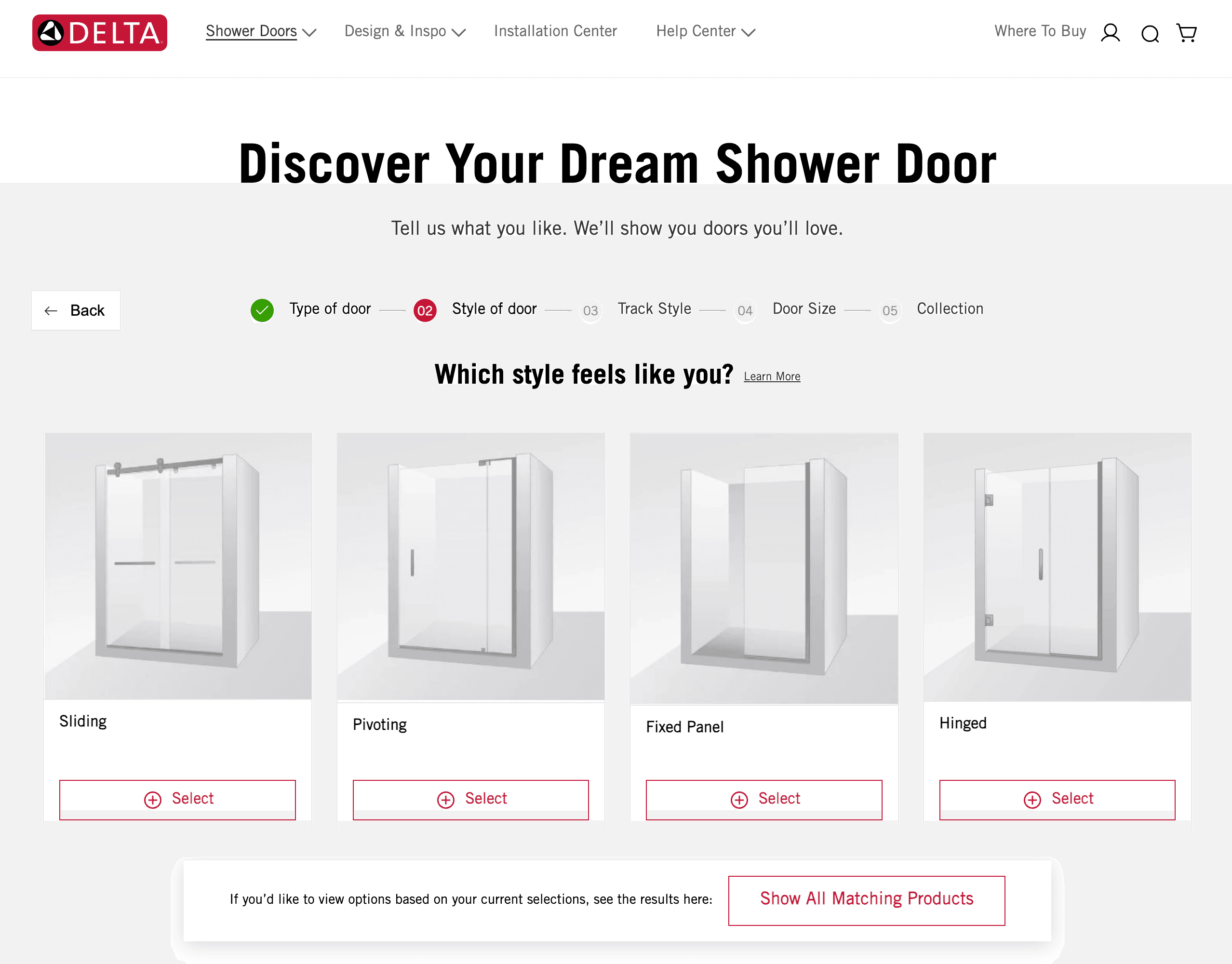
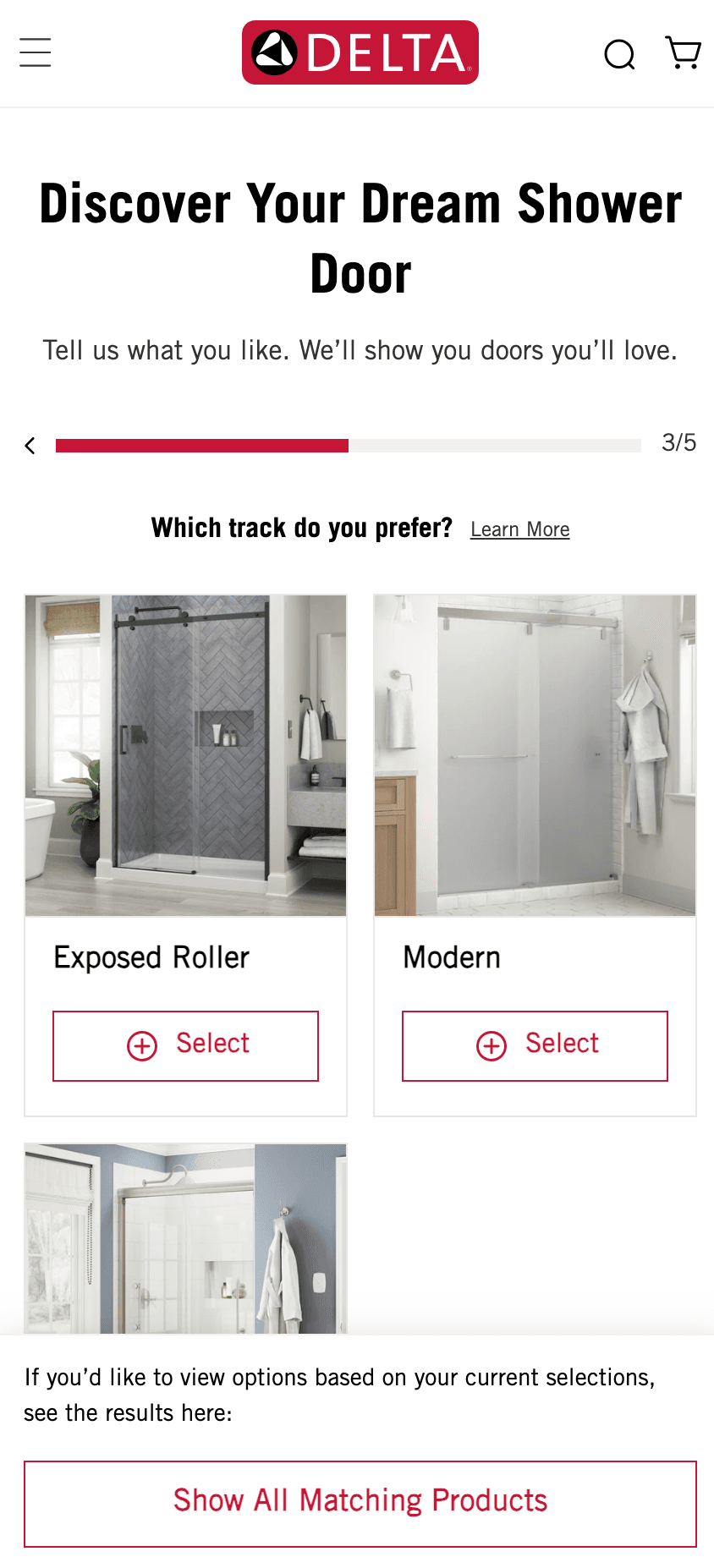
Based on the heatmap findings, I redesigned the Shower Door Finder Tool around a progressive disclosure model. The changes addressed both failure modes directly:
- One question at a time. Instead of displaying all five questions simultaneously (which allowed users to attempt Q2 before completing Q1), the redesign surfaces each question sequentially. Users cannot skip ahead.
- Explicit, labeled Select buttons. The image-only clickable areas were replaced with clear "⊕ Select" buttons beneath each option: unambiguous interactive affordances.
- Progress bar. A step indicator (Type of door → Style → Track Style → Glass Thickness → Collection) was added to orient users and reduce cognitive load.
Results
The results were measurable across both initiatives. Traffic grew 6x over the period. Installation-related searches dropped by 92%.
| Date | Installation-Related Searches | Site Traffic |
|---|---|---|
| April 2024 | 83 | 3,238 |
| May 2024 | 99 | 4,427 |
| March 2025 | 33 | 8,593 |
| April 2025 | 7 | 21,072 |
The pattern is the finding. In most analytics contexts, more traffic means more searches. Here, traffic grew 6x while a specific friction-related search category nearly disappeared. That only happens when the content is genuinely resolving user needs before they become search queries.
What This Demonstrates
The insights here didn't come from a single research sprint. They came from sustained attention to behavioral signals over time: the Algolia data told me what users were searching for, and the Hotjar heatmaps told me where the interface was letting them down. The redesign addressed both.
Fewer installation searches doesn't mean users needed less help. It means the interface answered the question before they had to search for it.
Let's ship it.
Tell me about the gig. I reply within a day, usually with questions.