At a glance
Overview
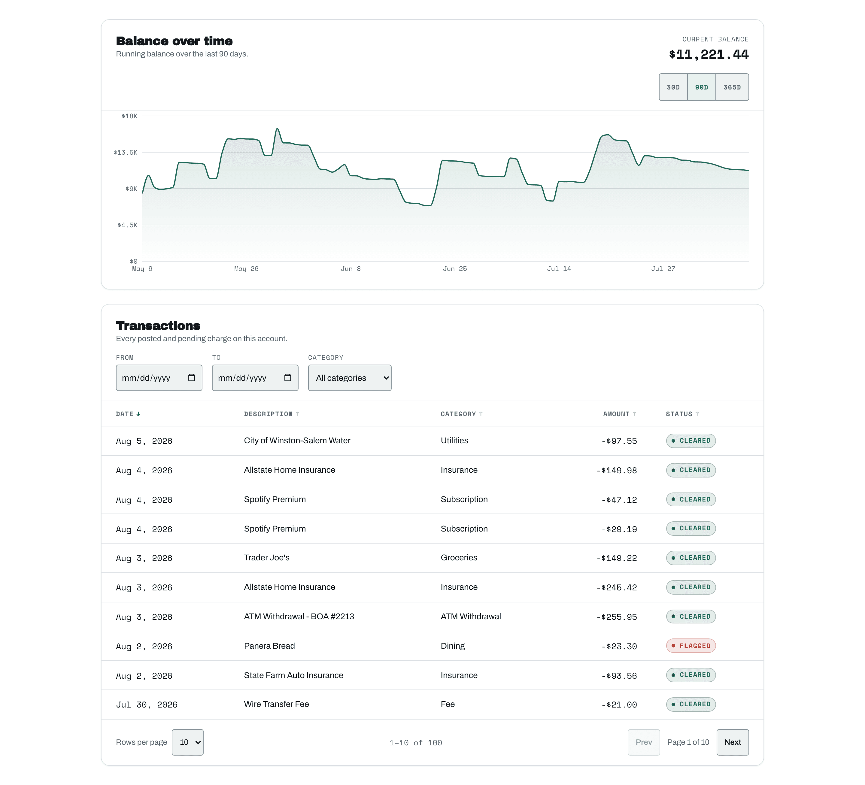
Most AI-generated dashboards look the same: dark background, one neon accent, a chart library's default colors bolted onto the page. I wanted to test something specific: can an AI-directed build, Claude Code end to end, with me setting the requirements and verifying every claim, produce a dashboard with an actual point of view, one that holds up under a real accessibility and testing pass instead of just looking finished on the first screenshot.
The target was a transaction history dashboard: a dense, sortable, filterable table and a balance-over-time chart. Those two components show up in every fintech product, and they're the two hardest things to make both usable and distinctive.
What It Is
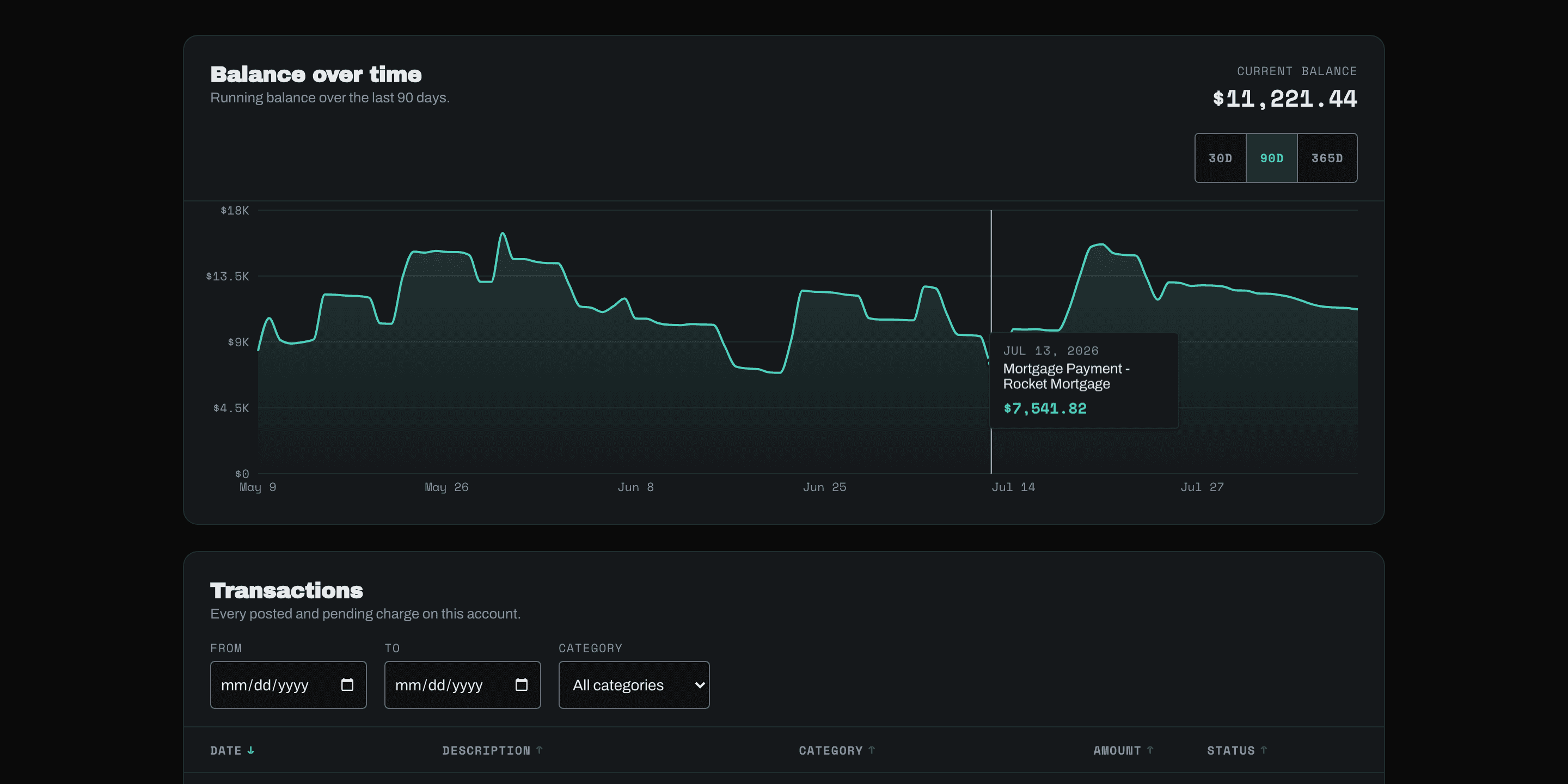
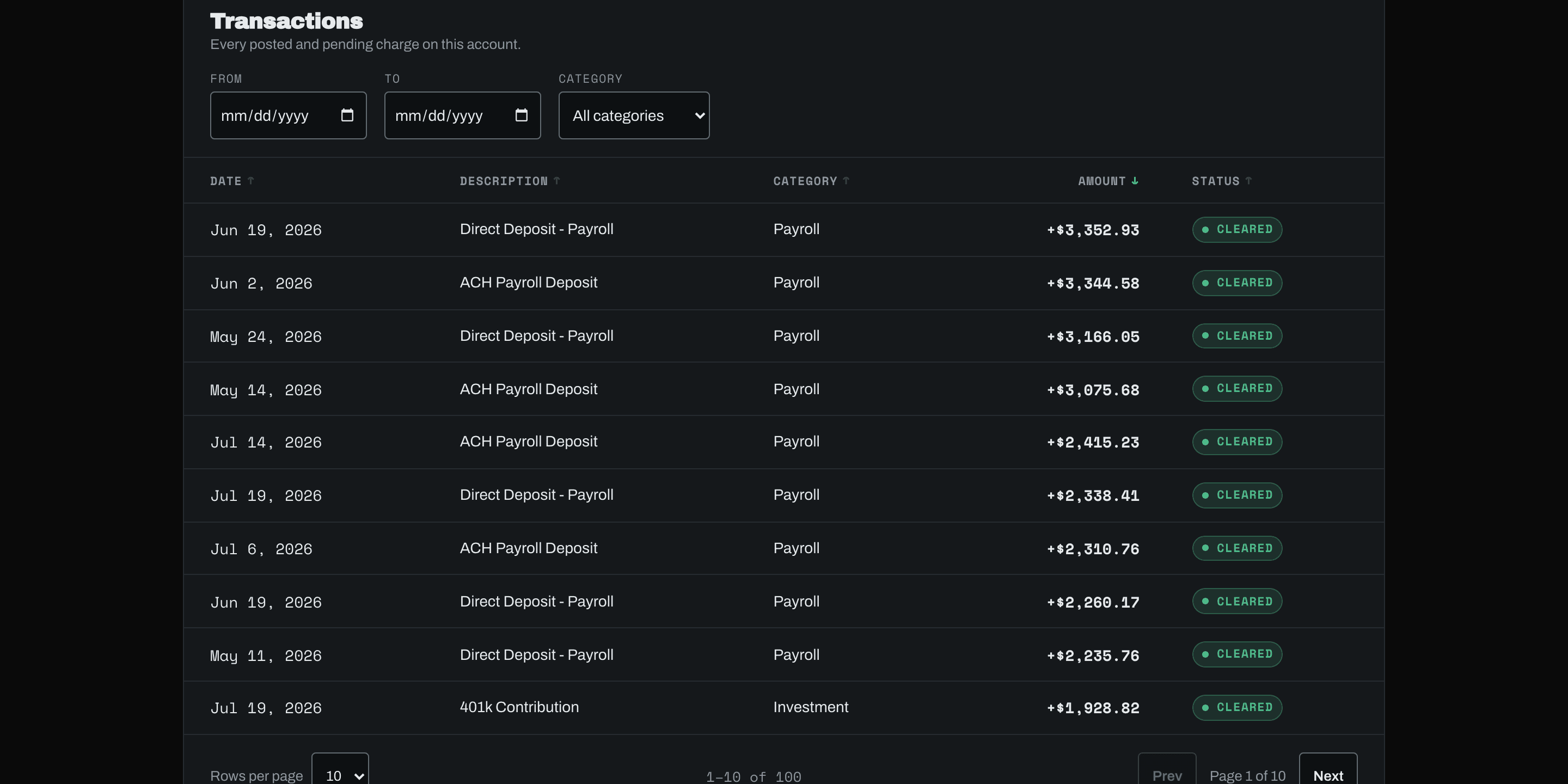
100 transactions, each carrying a running balance. The table sorts on five columns, filters by date range and category, paginates at 10, 25, or 50 rows, and collapses to a card layout below 640px instead of squeezing a table onto a phone screen. The chart is a 30/90/365-day area chart with a tooltip that shows the exact date and balance on hover, styled entirely from the app's own CSS custom properties. Not one color came from Recharts' defaults.
The type stack, Archivo, Archivo Black, Space Mono, comes from an existing Storybook design system. I built the color palette out from there: a teal accent instead of the default fintech blue or green, tabular Space Mono for every number in the interface, status badges styled like stamped ledger seals instead of Bootstrap pills. Small decisions, but they're the difference between a dashboard that looks like every other dashboard and one that looks like it belongs to this product.
See it live at dwest.foo/fintech.
Where It Got Interesting: Accessibility
Running a full accessibility pass instead of assuming the design looked accessible turned up real problems.
Status badges: contrast computed, not eyeballed
Computing actual WCAG contrast ratios, not eyeballing them, showed the "cleared" status badge at 4.26:1 against its own tinted background and "pending" at 4.06:1. Both sit under the 4.5:1 minimum for normal text. Darkening both colors, success from #2f7d5c to #256149, warning from #9a6b00 to #8a5f00, brought them to 6.07:1 and 4.67:1 without changing what they read as.
Borders that looked fine and measured at 1.3:1
Borders were worse: 1.3:1 against their backgrounds, where WCAG 1.4.11 requires 3:1 for interactive boundaries. Rather than darkening every hairline in the UI and losing the intentionally subtle divider style, I added a second token, --color-border-strong, used only on inputs, buttons, and toggles: the places a user actually needs to see a boundary to operate the control.
A focusable, hidden chart: the bug you can't catch by looking
The most interesting bug: Recharts v3 auto-enables a keyboard-focusable accessibility layer on the chart SVG. I'd wrapped that same SVG in aria-hidden="true" because I was providing a separate text summary for screen readers instead of exposing ninety individually-announced data points. Focusable but hidden from the accessibility tree is a real WCAG violation, not a style nitpick. Setting accessibilityLayer={false} on the chart fixed it, once a keyboard tab-order trace surfaced the problem in the first place. That's not a bug you catch by looking at the screen.
Testing
19 tests, Vitest and React Testing Library, covering sorting, filtering, pagination, and all three load states, loading, error, empty, across both components. The tests query by role and label, not CSS class: the way a screen reader or a keyboard user actually navigates the page.
Two infrastructure problems surfaced before the tests were trustworthy at all. Recharts needs a real ResizeObserver and non-zero element dimensions to lay out an SVG, and jsdom provides neither, so I stubbed both in test setup. And without an explicit afterEach(cleanup), DOM from one test leaked into the next, producing "multiple elements found" failures that had nothing to do with the components and everything to do with the test harness.
Responsive & Deploy
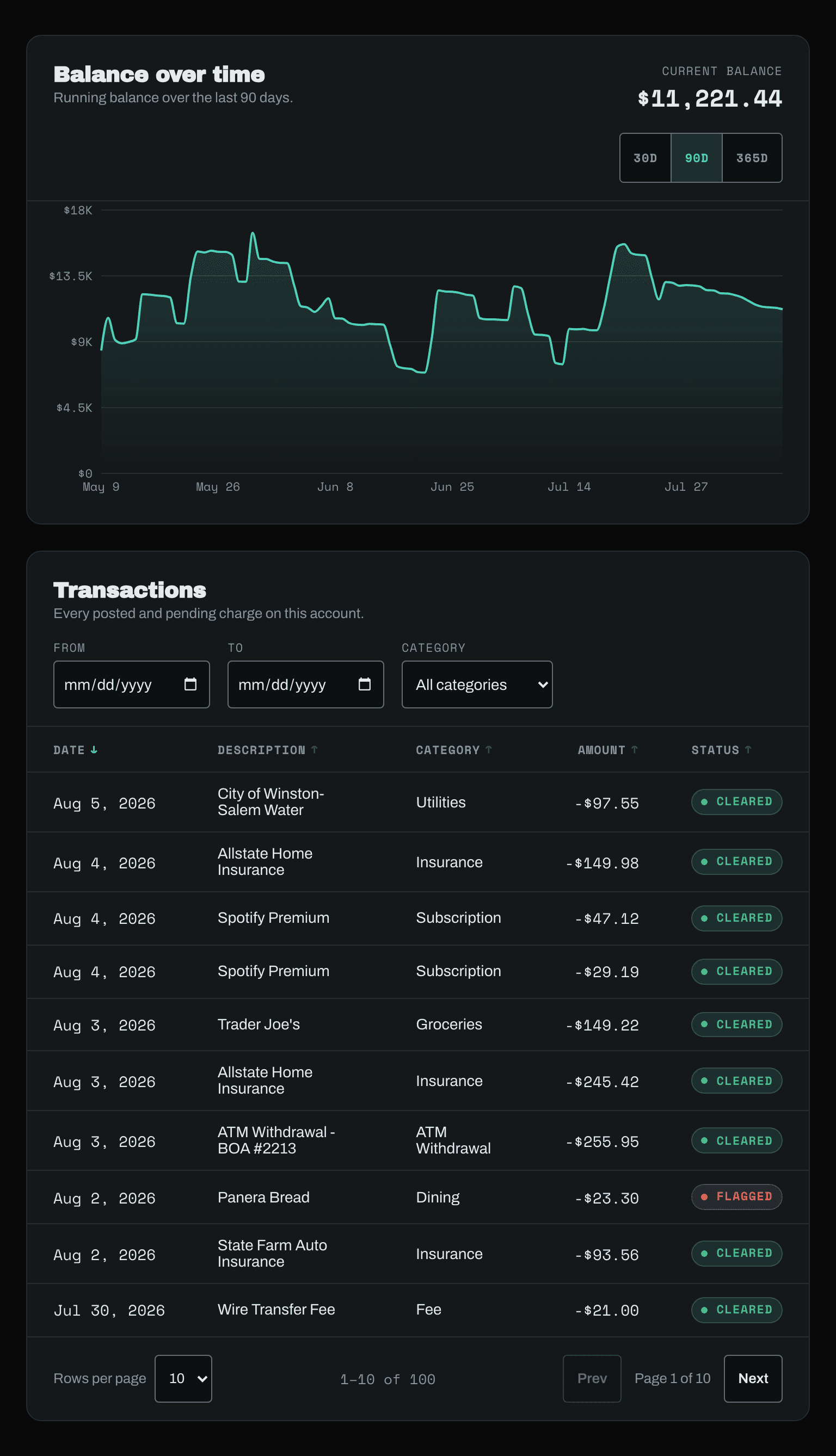
The layout held at 375, 768, and 1024px, checked against a real headless Chrome instance rather than a resized browser window: zero horizontal overflow at any width, the table-to-card breakpoint firing exactly at 640px, every touch target on the mobile layout measuring 44px or larger. The one deliberate exception is documented, not hidden: desktop sort buttons run 33px tall for information density, since the touch-friendly control at that breakpoint is a 44px "Sort by" select, not those buttons.
From there it went to Vercel. Later I reconfigured basePath and assetPrefix to run under a subpath instead of domain root, a change I verified against an actual production build and server before redeploying rather than trusting the config would just work.
What This Demonstrates
Not "AI can build a dashboard." Any tool produces something that looks finished. The actual claim: directing an AI build well enough to catch a WCAG violation that isn't visible on screen, compute contrast ratios instead of eyeballing them, and verify every claim, responsive, accessible, tested, against real headless-browser output instead of trusting the code that generated it, is a skill. That's the workflow I run daily now. This dashboard is the proof, not the pitch.
Let's ship it.
Tell me about the gig. I reply within a day, usually with questions.